A Short History of US Naval Camouflage in WWII
The origin of U.S. Naval dazzle camouflage had been in the First World War. The U.S. Navy assembled a camouflage design team during WWI that was supervised by the commercial painter Everett Warner. Warner was then influenced by the teachings of visiting British naval camouflage expert Norman Wilkinson who is considered the originator of the dazzle camouflage concept. During the war the Navy had considered and tested many camouflage design schemes, some by observing painted models in a specially designed stage. Toward the end of WWI, Warner had devised a technique for easily generating disruptive dazzle patterns, but was not able to use it before the war ended. In the inter-war years there was much discussion among camouflage experts and the Navy leadership concerning the best type of camouflage. Many favored camouflage schemes designed to provide low visibility whereas a few, like Everett Warner, favored the dazzle schemes, arguing that once a ship had been spotted it was more important for camouflage to confuse the observer as to the type and direction of the ship. This philosophical difference between these two almost mutually exclusive objectives continued on until the end of World War II.
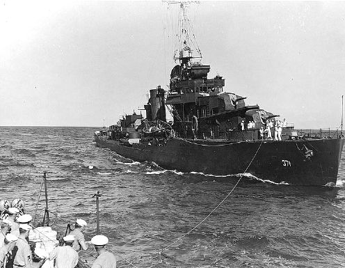
The U.S. Navy Bureau of Ships (BuShips) published the defining document for the U.S. Navy for World War II camouflage as: Ship Camouflage Instructions United States Navy usually referred to as SHIPS-2. There were four major issues of SHIPS-2 the initial release of SHIPS-2 was in January 1941, Revision 1 was in September 1941, Revision 2 in June 1942, and a Supplement to Revision 2 in March 1943. Each issue described, in detail, camouflage measures, paint colors, and their application. The January 1941 edition of SHIPS-2 gave this definition of camouflage: “Ship camouflage means painting a ship for the purpose of producing effects of low visibility and of deception in course and range estimation.” This was clearly an attempt to compromise between the two almost opposite positions of low-visibility versus deception. SHIPS-2 also introduced the term “measure” to identify particular camouflage schemes. While this site is primarily concerned with the dazzle camouflage used in 1944 and 1945 (i.e. Measures 31-32-33), I also include a synopsis of some (not all) of the significant measures specified in SHIPS-2 leading up to the later dazzle designs.
Measure 1 Dark Gray System
Measure 1 was introduced in the January 1941 release of SHIPS-2. This was the measure that most of the Pacific Fleet at Pearl Harbor was wearing on December 7, 1941 when the Japanese attacked, even though this measure had been discontinued by the September 1941 edition. All vertical surfaces above the top of the stacks were painted light gray (5-L). All remaining vertical surfaces, such as sides of the hull, sides of superstructure, stacks and lower masts were dark gray (5-D).
Measure 2 Graded System
Measure 2 was also described in the January 1941 version of SHIPS-2 and was a graded camouflage, which meant that the color was changed in steps over the surface of the ship, in this case vertically. All vertical surfaces above the deck edge were painted light gray (5-L). The sides of the hull were painted in three bands, the upper was light gray (5-L), the middle ocean gray (5-O) and the lowest was dark gray (5-D). The top edges of the bands followed the sheer line of the hull and were not horizontal.
Measure 11 Sea Blue System
Measure 11 was added in September 1941 to replace Measure 1 and was a solid dark color. It was felt that dark ships were less visible to aircraft observation, but not to surface level observation. Measure 11 was probably the result of tests conducted with destroyers before the war. Sea blue was a new paint mixture that could be made by mixing white and tinting material in the proper portions. It was selected to replace dark gray (5-D) which had to be mixed differently. This measure is often seen in early (1942) photographs and is sometimes confused with the later Measure 21, which replaced it. All vertical surfaces from boot-topping to the top of superstructure masses, pole masts and yards were painted sea blue (5-S). Horizontal surfaces were painted deck blue (20-B). About December 1941 navy blue (5-N) began to replace sea blue.
Measure 12 Graded System
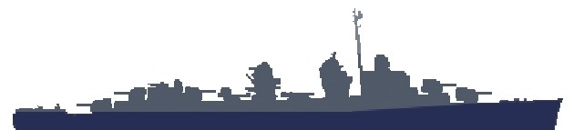
Measure 12 was added in September 1941 and was a another graded measure or system to replace Measure 2. Vertical surfaces from boot-topping to the main deck (except for carriers, it was the hanger deck) were painted sea blue (5-S). Vertical surfaces above main deck level, (hanger deck of carriers) to level of the top of the highest superstructure were ocean gray (5-O). Pole masts, yards, slender upper works above the level of top superstructure mass were haze gray (5-H). Horizontal surfaces were painted a uniform deck blue (20-B). The silhouette below is from the September 41 version of SHIPS-2 and shows how a Fletcher class destroyer would look in Measure 12.
Modified Measure 12 Dapple Patterns
Measure 12 was used as a basis for painting irregular patterns in an effort to break up the profile of the ship. These patterns were called “dapple” or “splotch” patterns. This has been given the name Modified Measure 12. The directions for painting the splotches were purposely indefinite; it was left up to the painter to create a pattern. On the hull the splotches were supposed to be ocean gray over sea blue (later navy blue). Above the hull on the superstructure they were haze gray over ocean gray. There is some evidence that some ships used greens as well. Sometimes an effort was made to match patterns on port and starboard, but many did not. Anyone trying to duplicate the pattern worn by any particular ship should obtain photos of both sides to be sure. SHIPS-2 warned that the splotch patterns had not been tested and that there was no first hand information concerning their effectiveness. Additionally, one report in July of 1942 was critical of the performance of splotches. Despite these cautions, a great many ships painted in splotch patterns in 1942, in fact the Atlantic Fleet had been ordered in a December 13, 1941 memo to use Modified Measure 12 with navy blue (5-N) paint now replacing sea blue (5-S).
Measure 16 Thayer System
The Thayer System was introduced in the June 1942 revision to SHIPS-2. This measure was similar to some British Navy camouflages used in the North Atlantic. It was considered especially well adapted for winter use in northern areas where nights were long and days were frequently overcast. The special feature of this system was its changeable character. At low levels of illumination a blue paint will appear relatively lighter and a red paint will appear relatively darker than these two paints appear in daylight. This visual change, known as the Purkinje effect, was utilized in the Thayer System. The pure light blue was selected because it appeared practically like white paint at low levels of illumination. The ship would therefore appear like a white ship on moonless nights or during twilight when white or very light ships were the best for reduced visibility. During daylight hours or under bright moonlight the pattern would be apparent and might produce some deception in the estimation of the target angle. A darker blue would produce more deception but was not used because it would not appear white at night. The purity of the color was an important factor in the Purkinje effect.
The entire ship was painted white (5-U) and a pattern using Thayer blue (5-B) was painted on top of that. Some example patterns were supplied in SHIPS-2 and some of these patterns were reused later in the Measure 31-32-33 dazzle schemes. See Measure 16 Patterns Reused. This system also employed “countershading,” which was the application of white paint to the underside of projecting decks and overhangs, in an effort to hide or lessen shadows.
Measure 21 Navy Blue System
Measure 21 was introduced in the June 1942 revision to SHIPS-2 as a dark system to replace Measure 11. SHIPS-2 stated that this measure provided the lowest visibility to aerial observers during daylight or nighttime and in all types of weather. Also, it was felt that while a ship painted in Measure 21 was highly visible to surface observers in all types of weather, it did cause some course deception. In September 1942, the Pacific Fleet was ordered to paint using Measure 21, probably driven by the Japanese air threat, and most of the fleet was painted in this camouflage by 1943. Thus, almost all of the ships headed to the Pacific that completed or commissioned in 1943 were initially wearing this measure. All vertical surfaces without exception were navy blue (5-N), which had replaced sea blue (5-S), and all deck and horizontal surfaces were deck blue (20-B).
Measure 22 Graded System
Measure 22 was also introduced in the June 1942 revision as another graded system to replace Measure 12. This measure was intended for use on combatant ships in areas where bright weather with fair visibility predominated, and high angle aerial observation was unlikely. Navy blue (5-N) was applied to the hull up to the height of the main deck edge at its lowest point with the upper edge of this navy blue area horizontal. Haze gray (5-H) was painted on all remaining vertical surfaces and all masts. Deck blue (20-B) was applied to all decks and other horizontal surfaces. The undersides of overhanging horizontal surfaces were painted with white (5-U) to lighten shadows. Measure 22 was primarily to reduce the visibility of the ship when viewed at a distance by blending with the horizon, however Everett Warner, who was advocating disruptive designs, criticized it. This measure was sometimes referred to as two-toned North Atlantic gray and Atlantic Fleet Command ordered its use in March of 1943; so most ships wore this camouflage while in the Atlantic during 1943 and into 1944.
Therefore, in 1943 ships destined for the Pacific were painted in Measure 21 and ships slated for the Atlantic were painted in Measure 22, as evidenced by this memo. Both Measure 21 and Measure 22 remained in effect until the end of the war in 1945, and were in fact revived in February 1945 when the Bureau of Ships recommended all ships repaint using Measures 12, 21 or 22. Some ships had begun the migration back to those Measures earlier and some ships had remained in Measure 21 or Measure 22 even while others used the dazzle patterns. Also in 1945, navy blue was replaced by navy gray, which was mixed from black instead of purple tint, because of shortages and because it was finally realized that tone itself was more important than the actual color. However, from black and white photos navy blue and navy gray are almost indistinguishable.
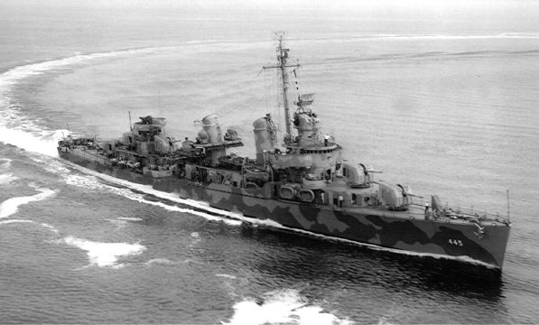
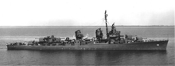
Measures 31, 32 and 33 Dazzle Patterns
Measures 31, 32 and 33 were introduced in the March 1943 supplement to SHIPS-2, although the supplement was not distributed until May 1943. These Measures included patterns that had been developed earlier in experiments with both ships and models. The patterns were specifically designed for each class of ship using a range of colors usually in the blue-gray range, but some were in the green-gray range. Ultimately auxiliary ships and landing craft were the only types to use the green-gray range of colors. After internal discussions and deliberations, the Pacific Fleet requested BuShips begin a major effort to expand the number of designs for all the types and classes of ships. The Pacific Fleet then officially adopted the new Measures in October of 1943, and the major combat ships began showing up in Dazzle patterns later in October and November. The Atlantic Fleet did not officially adopt any pattern or “dazzle” measures until July of 1944, and then only Design 3D for destroyers and destroyer escorts and Design 4A for escort carriers.
Some representative drawings of the new Measure 31-32-33 patterns had been included with the original March 1943 supplement to SHIPS-2; but these were probably not enough because BuShips sent PacFleet a memo in July 1943 with additional pattern drawings and instructions on how to adapt them to additional classes of ships. The Pacific Fleet Maintenance Office (FMO), who would ultimately be responsible for the painting and maintenance of the Fleet in the Pacific, then sent in October 1943 a suggested assignment list of those design drawings to the ships then assigned to the Pacific Fleet. Part of this assignment list states that destroyers and destroyer escorts with even hull numbers should use Measure 31 and odd numbers Measure 32 and that carriers and cruisers with even hull numbers should use Measure 33 and odd Measure 32. The evidence that this rule was followed is so persuasive that this is how those ships are listed unless other strong evidence shows otherwise. This assignment was along with instructions to send each ship’s commanding officer a copy of the camouflage drawing selected for that ship. At that time the Camouflage Section must have shifted to maximum production of new and existing camouflage designs to meet the needs of the Pacific Fleet. Also, the Camouflage Section probably wanted to ensure the early designs were adapted to each class of ship properly, so most of the “capital” ships, e. g. carriers and battleships, were given new design drawings with patterns better adapted to their profiles. In fact, not all ships painted in camouflage to agree with the above-suggested camouflage patterns from October 1943. This was partly caused by “adjustments” made to the list by the Camouflage Section in Washington; a memo was eventually sent in June 1944 to the Pacific Fleet explaining and tabulating the reassignments for at least the destroyers and destroyer escorts.
The Dazzle patterns were systematically given identifying numbers. The first part of the number identified the Measure and therefore the color range. An example would be camouflage Design 32/16D where the number 32 indicates Measure 32. The second part of the number indicates the design number, in this case 16. The last letter was used to identify the type of ship for which the design was originally intended. In this case the D was for destroyers; A was for aircraft carriers, B for battleships, C was for cruisers, F was for freighters, L was for landing ships, M was for mine warfare ships, and T was for transports. Sometimes dual letters were needed: Ax was used for auxillary ships, AO was for tankers, and SS was for submarines; in addition, small extra letters either a or b were added on to indicate specific variations on a particular design. However, two very different designs could have the same number, but different letters, for example 3A and 3D were very different and unrelated designs. Many designs for one type or class of ship were redrawn for other classes; as an example, Design 16D was also drawn up for the California class battleships, the Baltimore class heavy cruisers and the Mettawee class gasoline tankers. Usually, the number and letter were kept the same, but in some cases new design numbers were given. Thus, this numbering system did not always remain entirely consistent.
Each design had a master drawing that depicted how the pattern should appear for a specific class of ship. Everett Warner, who in early 1942 had been rehired as a consultant by the Navy, just as he had been during World War I, approved each drawing. Most drawings were sent out with his initials and an approval date. A total of well over 300 different design drawings, most with two sheets were produced and distributed to over a thousand different ships during 1943 and 1944. Some design master drawings were not specific to a measure or color range and were referred to as “open.” Those design numbers began with 3_ to indicate that the color range was optional. Examples are : Designs 3_/1D, 3_/7D and 3_/14D for the Fletcher class destroyers. When it became necessary to send a copy of the drawing to a particular ship, a copy of the master could be made with labels added or changed to match the required Measure. These masters were copied and distributed in two ways. One method was the use of the Ozalid©, which was a machine for making black and white copies of large drawings such as blueprints. The advantage of larger drawings was the ease for the painters to lay down and apply the design; this process often resulted in cutting and destroying the Ozalid© copies. The other method was to send the drawings to the Bureau of Aeronautics which maintained a photo lab. Then the drawings were photo copied by a large format copy camera and 8-by-10 prints could be generated. These prints were probably more convenient to carry or mail; by this time BuShips had assigned trained camoufleurs to many forward bases and they could use the prints for reference and even possible creation of new Designs or variations. The surviving record of these drawings is from the archived copies from the Bureau of Aeronautics photos; it is also likely that not all design drawings have been preserved in that manner.
Additionally some ships seem to have painted in Measures other than the Measure designated by BuShips. One reason why this might have happened was, due to the large volume of work by the Camouflage Section to generate drawings for distribution, there may have been some labeling errors. Also local conditions might have caused a change; it is possible but not too likely that an individual ship commander would have decided to use a different camouflage on his own. So, the reality is that the final determination of a ship’s camouflage Measure and Design is sometimes based on suppositions from letters and memos and aided by difficult photo interpretation because one is forced to try to interpret color from black and white photos using only tone. The final selection of color range was decided by fleet and force commanders and not by the Camouflage Section in Washington, but the great majority of ships painted in the suggested design and colors.
Because of much controversy about the effectiveness and possible visibility issues of the Measure 31-32-33 disruptive camouflage designs, in the middle of 1944, Everett Warner toured and surveyed the Pacific Fleet. In September 1944, he returned a report that stated that the dazzle camouflages were effective under the conditions for which they were designed, but also recommended that the horizontal patterns on destroyer class ships were not effective and should be discontinued. After that date many ships, not just destroyers, had only solid deck blue on their horizontal surfaces. However, despite Warner’s optimistic report many commanders in the Pacific continued to ask for patterns that had less contrast and fewer light colors so as to not stand out as much at night or in low visibility. In October 1944, the Commander of Service Forces in the Pacific asked BuShips to decrease the use of the lighter color paints which BuShips resisted (Everett Warner wrote the dissenting reply on the routing cover).
Beginning in December of 1944 instructions were given for changing back to Measures 12, 21 and 22 from the dazzle patterns, probably driven by the threat of kamikaze attacks (the Dazzle patterns were known as less effective against aerial observation). A January 1, 1945 letter from the Commander Pacific Fleet recinded the October 8, 1943, order to use Measures 31-32-33 and directed the use of only 12, 21 and 22. Thus, starting in early 1945, many ships painted over their dazzle designs into either Measure 21 or 22 often using the new navy gray which was mixed using black instead of purple tint. Even so, some other ships in the Pacific remained in dazzle patterns until the end of the war in September. Finally, BuShips gave in and formally documented an additional supplement to SHIPS-2 in March 1945 that discontinued all disruptive patterns except the irregular patterns of Measure 31 mostly for landing ships. The Atlantic Fleet directed ships to repaint in Measures 12, 21 and 22 in April of 1945, to avoid repainting when transferring to the Pacific.
Measure 31 Dark Pattern System
Measure 31 used patterns with a dark range of colors, which resolved to approximately 10 to 15 percent reflectance. For almost all regular patterns, the specified vertical colors were dull black and ocean gray or haze gray and if three colors dull black, ocean gray and haze gray. Although, this measure was primarily intended as a low visibility measure against observation by aircraft, it had the added advantage of confusing the ship's identity and breaking up the lines of the ship once it had been seen, however it was felt that it provided little course deception.
Measure 31 also included a few irregular patterns reminicent of, but larger than the splotches. These irregular patterns usually used colors in the green range and were worn by some auxiliary ships and a great many amphibious ships. Prior to the introduction of Measure 31 amphibious ships were to be painted in the “Tropic Green System” identified by this memo. Later, a February 12, 1944 memo from the FMO to the Bureau of Ships requested that all landing craft and ships be painted in Measure 31 Designs 5L, 6L, 7L, 18L and similar designs using the colors green, brown and black. Measure 31 green patterns for landing craft remained in effect when the rest of the Pacific Fleet was ordered to paint over the dazzle patterns on January 1, 1945. Then, on February 20, 1945 BuShips instructed that all landing craft and ships involved in beach operations should be painted in Measure 31 Designs 5L or 8L.
Measure 31 Design 20L using greens, brown and black was recommended by FMO on July 8, 1944, through a memo sending a “Master” pattern for the design. It was intended to be overlaid on an existing ships's profile drawing and the pattern of panels transferred to create a camouflage drawing that could be sent to a ship or yard for painting. Some examples of the result were also included. This Master was created during the time that Everett Warner was visiting and observing the Pacific Fleet, so he probably approved the drawing. On August 19, 1944, this memo instructed APD's to use 31/20L.
Measure 32 Medium Pattern System
Measure 32 was primarily effective in areas where visibility was generally high and it was impossible to conceal vessels at close ranges no matter how they were painted. This measure was intended to produce deception at close ranges and low visibility at those ranges where the patterns resolved to a uniform shade. It was considered the measure that provided the best defense against visual detection by submarine. The patterns resolved to a medium shade between 20 to 40 percent reflectance. Most of the vertical patterns used the colors dull black and light gray or if three colors were used, dull black, ocean gray and light gray. SHIPS-2 stated that once vessels were detected by radar, visibility was of little importance compared to deception. SHIPS-2 also stated that bold contrast was necessary to produce the most deception and this measure provided the most contrast.
Measure 33 Light Pattern System
Measure 33 was an antisubmarine measure composed of designs that resolved to a light gray of approximately 40 to 50 percent reflectance. It was primarily a low visibility measure having the added advantage of a pattern that made recognition more difficult. The vertical colors used by this measure most often were ocean gray and light gray or pale gray; if three colors were used they were navy blue, haze gray and pale gray or navy blue, ocean gray and light gray. This measure was considered effective under the same conditions as the earlier Measure 16. However, even when broadside to strong sunlight Measure 33 was less vulnerable than Measure 16 because no plain white was visible. Ships painted with this measure were presumed to have high visibility from high angle aircraft observation.
Measures 31a, 32a and 33a
These Measures appeared late in the fall of 1944 and were each offshoots of 31, 32 or 33 respectively. Each used a similar color range to maintain a similar reflectance range, but apparently attempted to achieve less contrast. So lighter dark colors and darker light colors were used. Measures 31a, 32a and 33a also used new patterns, some of which were derived from existing patterns. The first mention of Measures 31a, 32a and 33a seemed to be in Everett Warner’s September 1944 report.
There were many ways that ships varied from a specific camouflage design. The most common variation was simply due to aging. Many ships were at sea for weeks or months between port visits and had few chances to repaint, particularly the hull. Often photographs of ships at sea show a good deal of scraped and peeled paint on the hull.
The actual colors used on ships sometimes depended on the ship and force commanders and the crews that had to apply the paint and maintain the ships. Sometimes the colors used on individual ships were different than the specific drawing because the colors had to be mixed locally. There were also cases that because of shortages of certain colors the painters were forced to adapt the color scheme.
A few ships carried more than one design within the Measure 31-32-33 system. In most cases, the use of multiple designs was because the ship had been assigned to a different command or to a different fleets and had to change because of the different requirements. It was common for a ship to wear one camouflage when assigned to the Atlantic Fleet and another when assigned to the Pacific.
SHIPS-2 included instructions for painting the hull numbers that specified the size of the numbers but not the position. Thus hull numbers were painted in slightly different locations by different ships using sometimes white and sometimes black paint.
Finally, there were many cases of painters that misinterpreted or misread the design drawings and applied the wrong color or even “extra” panels. Several ships have “extra” panels painted on the stern due to interpretation difficulties with the stern views of the camouflage drawings. Many drawings included stern views and those stern views included the aft most panels from each side, but viewed nearly edge on. These views seem to confuse the camouflage painters and cause them to add unneeded panels to the stern. Since there are so many instances of this, it is clear that there was some confusion and the drawings were ambiguous. One can just imagine the many discussions in wardrooms and shipyards over the correct interpretation of some of these drawings. These different interpretations of the stern views resulted in two variations for almost every design drawing that showed a stern view. I have written an article that gives a good overview of the differences “from a different angle.”
The best sources for information about the paints used by US Navy ships for camouflage during World War II are the website called The Ship Camouflage Website, and the book Camouflage 1, both are also listed in the sources. Snyder and Short Enterprises, host of the website, and the publishers of The Floating Drydock catalog sell paint chip charts as well as premixed paints for modelers. Both sources also offer data about the camouflage paints along with mixing information so that colors may be duplicated.
The table below lists all the colors that are mentioned here. Purple tint was used to mix with white to obtain the blue-gray colors listed except for dull black, dark gray, deck blue and Thayer blue, each of which came pre-mixed or used another tint. The reflectance values are provided as an interpretation aide when comparing photos with similar sun or light conditions.
| Color | Navy Designator | Reflectance |
|---|---|---|
| White | 5-U | 75% |
| Pale Gray | 5-P | 55% |
| Thayer Blue | 5-B | 50% |
| Light Gray | 5-L | 35% |
| Haze Gray | 5-H | 28% |
| Haze Green | 5-HG | 28% |
| Ocean Gray | 5-O | 18% |
| Ocean Green | 5-OG | 18% |
| Sea Blue | 5-S | 11% |
| Navy Blue | 5-N | 9% |
| Navy Green | 5-NG | 9% |
| Navy Gray (1945) | 5-N | 9% |
| Dark Gray | 5-D | 7% |
| Deck Blue | 20-B | 7% |
| Dull Black | BK | 2% |
| Purple Tint | 5-TM | 2% |
Table of Color Combinations
| Paint Combo in Pattern | Measure 31 10----15 |
Measure 32 20----40 |
Measure 33 40----50 |
| Black (BK) + Ocean Gray (5-O) | 12.8 | ||
| Black (BK) + Haze Gray (5-H) | 19.8 |
||
| Black (BK) + Light Gray (5-L) | 24.7 | ||
| Navy Blue (5-N) + Haze Gray (5-H) | 20.8 | ||
| Navy Blue (5-N) + Pale Gray (5-P) | 39.4 | ||
| Ocean Gray (5-O) + Pale Gray (5-P) | 40.8 | ||
| (BK) + (5-O) + (5-H) | 19.2 |
||
| (BK) + (5-O) + (5-L) | 22.7 | ||
| (5-N) + (5-O) + (5-L) | 23.3 | ||
| (5-N) + (5-H) + (5-P) | 36.0 | ||
| Thayer Blue (5-B) + White (5-U) | 63.7 |
This table gives the calculated reflectances of various combinations of paints for patterns. The columns give an idea of where those calculations would fall relative to the stated ranges of reflectance for Measures 31-32-33. These calculations were simplified by assuming equal areas for each paint within a pattern, which was definitely not true for all patterns. Measure 31 included combinations of black and ocean gray as well as black, ocean gray and haze gray and these fall within the range. Measure 32 used black and light gray as well as black, ocean gray and light gray and those combinations fall within the range of 32. Haze gray with black is just a little darker than the Measure 32 range but still was labeled Measure 31. Substituting navy blue for black to decrease contrast only lightens the combination slightly. Measure 16 colors, Thayer Blue and white, are included to show where that combination would be in reflectance.
These values were calculated using a root-mean-square (RMS) technique since reflectance values are area measurements and cannot be combined using a linear average.
For example, the calculation for "Black (BK) + Ocean Gray (5-O)" is:
| √ | (22 + 182) / 2 |
with any comments, suggestions, or criticisms.
Site last updated: March 1, 2019
Copyright © C. Lee Johnson 2016, 2017, 2018, 2019